Tuesday, May 27, 2014

HEURISTIC EVALUATION

INTRODUCTION

This report is about heuristic evaluation on A'kina Islamic Boutique website.


A'kina Islamic Clothing

http://www.akinaislamicclothing.com/


FINDINGS


1.    Visibility of system status

First, an A'kina Islamic Boutique website makes the buttons change after user clicking the buttons to show that are the page that user are visiting. Secondly, they show the direction where the user is now. Lastly, in the website provides an indicator


12.  Match between system and the real world 


the language used in the website in the red box. A'kira Islamic Clothing boutique is use universal language it is English for their website


13.    User control and freedom


the emergency button to update or to remove the item if the user is incorrectly entered the data or details needed by the system. For A'kina Islamic Clothing boutique website provides 'View Cart' button after user click add to cart after entered the details of the item. Click the 'View Cart' button to edit or update the item details or remove the item if the user does not buy the item.


14.    Consistency and standards


the consistency in every page of the A'kina Islamic Clothing website, the placement of logo, search box, buttons, site maps, indicator and the image is the same on all pages.


15.    Recognition rather than recall


First, they use simple symbols to describe twitter and Facebook. Secondly, they just use word button to dhows that is the search button to be clicked if user want to search the item. Third, the website just using simple words to describe shopping cart, they just use 'Shopping Cart' word to describe it. Lastly, there are two arrows at the bottom of the slide image, the arrows is to change the image in the slide.


16.    Error prevention


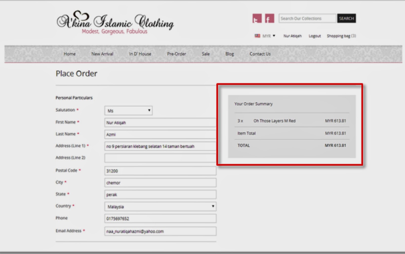
User will get onto this page after they confirm the item they want to buy. There is the details of the item that user key-in before and user needs to make a confirmation before proceeding to the payment and submit the form


17.    Aesthetic and minimalist design


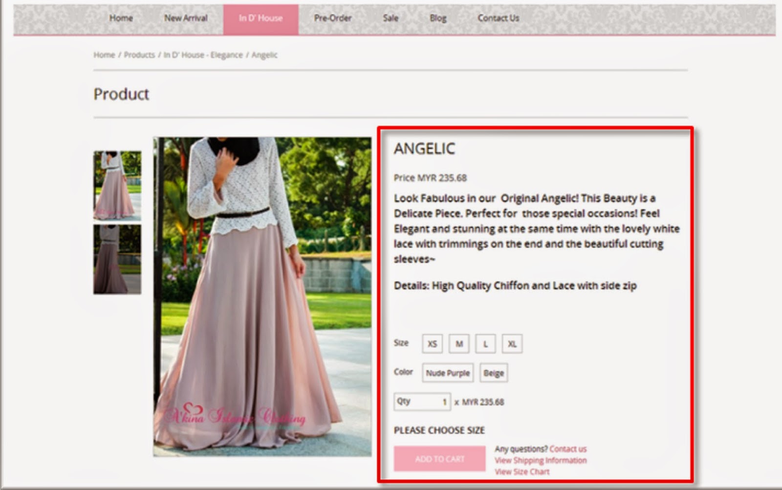
The information is simple, but containing the important message of the dress such as material of the cloth, the cloth details, size available, color available and the price according to the quantity of the item. There no unnecessary information or advertisement available. The interface designs is really simple, the color use is pink at the buttons and the main color of the website is white and the white space is balance.


18.    Help users recognize, diagnose, and recover from errors


Before user add the item to cart or before ‘Add to Cart' button is available user need to choose the size and the color of the item. There is an indicator as marked in the red box above shows the instruction how to do before proceed to the next step.


19.    Help and documentation


This website provides the direction at which page is useable now. For instance, at the interface shows the user is coming to this page starting from the home page, through the product page and In' Dhouse-elegance page and no user on the Ingrid bliss page.


CONCLUSION

For the conclusion, A'kina Islamic Clothing online boutique meets the Jakob Nielsen heuristic evaluation and so far there is no major problem occur on this website. This website also, provide an indicator to avoid user list and there are indicators show the problem that user done and provide helps. Overall, this website is simple, but good and providing comfort and ease of use.


REFLECTION

This assignment is to evaluate the website chosen by using heuristic evaluation.  Why using heuristic evaluation? Because it is quick, cheap and easy method to evaluate the interface design. The goal is find the usability problem in the design. There 10 type of evaluation available in this heuristic evaluation to use to evaluate the website chosen. For my assignment there 9 evaluation used to describe and prove the interface design problems in  A'kina clothing boutique website. By the evaluation I know more about usability of a website. A website should make user feel easy, comfy and quick to use it without any problem.


USABILITY EVALUATION

Students are given the assignment with three options : 
1) Report : Usability evaluation of a mobile device or device
2) Report : Pervasive computing in the environment
3) Report : Redesigning pervasive computing


For my assignment, I have choose option 1. Pervasive computing that I choose is CIMB Bank Automated Teller Machine (ATM).


INTRODUCTION
These devices were selected for the study to examine the 'Usability goal and Usability-in-itself of Automated Teller Machine (ATM) Of CIMB Bank. ATM is an electronic banking outlets, Which Allow user complete the task, such as withdraw cash, bill payment, cash transfer, balance inquiry or others in a short time without Having to queue at the counter.

METHOD OF RESEARCH
Method chosen is quantitative. For this report technique used for research is questionnaire. By distributing questionnaire only to do some research and to get the finding of the usability evaluation. The questionnaires are distributed in the bank according to evaluate the ATM in the environment.

CONCEPTUAL FRAMEWORK
Conceptual framework that be used for this evaluation report is usability goal and usability-in-itself. The objective of the research is to study the usability goal and usability-in-itself of Automate Teller Machine (ATM) of CIMB Bank.

ANALYSIS
Usability goal
Every person like to use ATM machine rather than going to the counter because it can reduce time, efficient and easy to use. So the CIMB ATM meets their usability goal.

Usability-in-itself
Almost all user is agree on the usability-in-itself of the CIMB ATM. 


REFLECTION

This assignment is the key assignment to this module. Means all things that learn in the class is applied in this assignment. The prove is this assignment require students make a report that using the research. The research can be conduct by using quantitative (questionnaire, survey, test) or qualitative (interview, observation, testing). Before that, student need to decide the question framework to be distribute to the respondent. Framework used in my assignment is usability goal and usability-in-itself of the CIMB ATM. So that framework will be the theme of my questionnaire that distributed to the respondents. Other framework available is usability-in-life, heuristic evaluation, Schneiderman's rules and many more. The purpose of this assignment is to expose to students be a researcher and analyzer also give more knowledge about evaluation. Other than that, student is exposed to know and differentiate the differences between pervasive computing and mobile device.  


PAPER PROTOTYPE

FIRST STEP
Pick at least three task : one easy task. one medium difficulty, and one hard task.

- Easy task : Open water in bathroom
- Medium task : Washer machine
- Hard task : Bake a cake control


SECOND STEP
Build two different paper prototype of interface.

- Easy task
Design by Wan Nabilah

Design by Nur Atiqah (Me)


- Medium task
Design by Wan Nabilah

Design by Nur Atiqah (Me)


- Hard task

Design by Nur Atiqah (Me)

Design by Wan Nabilah


THIRD STEP
Prototype that meet the usability goal

- Easy task


- Medium task


-Hard task


FORTH STEP
Description of the chosen interface.

- Easy task
--> This device will be place in the wall and only the screen will be appear within the wall
--> more interactive and provide the indicator such as the device title and button name
--> we will know this device is use for open the water because the background of the interface has the picture of water
--> there are  3 functions in 1 device which is to open water from the sink, shower and tub.


- Medium task
--> the interface is more interactive and readable.
--> Each of the button provide an indicator and labeling to show which buttons and controller is use
--> For example, if user press the start/pause button, the button will change the color into orange otherwise, the color is green. It is the same as the controller
--> it is safety because the device provide child lock to prevent from children play with the washer machine button
--> this device all things done by touch on the touch screen


- Hard task
--> This controller is designed for user bake a cake easily just in 1 controller.
--> The device is such using the tablet or smart phone but it fixed for baking.
--> The interface make the user feel the baking is more fun and easy
--> There are 5 function in 1 device which is add, knead, pour, shake and bake
--> the interface show the pour section is different background color becaue to show which step is user are and each step they done there an indicator with blue color to show that the user choose


REFLECTION

We able to produce a paper prototype with different level of task. To design the prototype we use the guideline of interface design explain by my lecturer. The guideline used is to reduce short term memory, to attract user, to notice user to the product function, and many more. It is also teach us the way to achieve or meet the usability goal of the product by see the paper prototype. Just see using a paper user will know what product is it and know how the product will be function. A proper explanation is needed  to describe and guide user about the product.

DESIGNING LOGO


chef hat : to show the passion with cooking
Ika's : is my name
kitchen : the place that i usually cook
three dots : continuously grab the dreams

chocolate color : show the initial color for cooking
black : be strong 


REFLECTION

this assignment is teach me  match pictures with explanatory example icon mix and match, if the picture icon show house picture means that it is navigate to the home page. 

MOCK-UP OF PAPER PROTOTYPE


Interface Design

Mock-up


Mock-up is prototype of interface design. For this assignment I choose medium task which is washer machine interface as my mock-up.


REFLECTION

the purpose of mock-up is to transform paper prototype into real prototype, but make sure the interface is 100% same as the paper prototype. For this assignment I learn how to promote the product by using real prototype. People can feel the device as the real device. If we give people try the product just by using paper prototype, people will feel confident in the ability of the products. If to sell the product should show the prototype and let them use the prototype and take the feel of the product, by that people will fell confident with the product.

PERVASIVE COMPUTING

INTRODUCTION
Our group is developing usability testing of Cimb Bank Sdn. Bhd. Automatic Teller Machine (ATM) around Perak. Usability testing is a technique for ensuring that the intended users of a system can carry out the intended tasks efficiently, effectively and satisfactorily. It also can improve ease-of-use during the design process and known the error that occur. The task that our group has to do is to know the usability of ATM machine, and the task to know the usability testing is withdrawing money.


FINDINGS
All respondents is able meet the usability of withdrawing money using CIMB Bank ATM machine. They use it fast and without having any problem. Time estimate they use the ATM is below one minute.


REFLECTION

The purpose of this assignment is to expose student to the pervasive computing such as ATM machine, kiosk, bill payment machine, ticket machine and another pervasive computing available within college area. Before this I do not know what is pervasive computing, after conducting this assignment I know what is the pervasive computing and its function by make an interview to three respondent. 

Thursday, May 1, 2014

ABOUT THE BLOG OWNER


Name : Nur Atiqah Binti Azmi
Study : Kolej Poly-Tech MARA-Ipoh
Program : BSC(Hons) Multimedia Computing
ID number : CVB130904185
IC number : 920729075536
Address : No 9, Persiaran Klebang Selatan 14,
Taman Bertuah 31200  Chemor,
Perak